Most people assume mental health awareness colors were picked by a committee that liked a particular shade. That’s not really how it happened. Several of these colors were chosen deliberately, with direct reference to psychological research or a specific cultural signal the founders wanted to send. When you know the reasoning, the colors carry more weight.
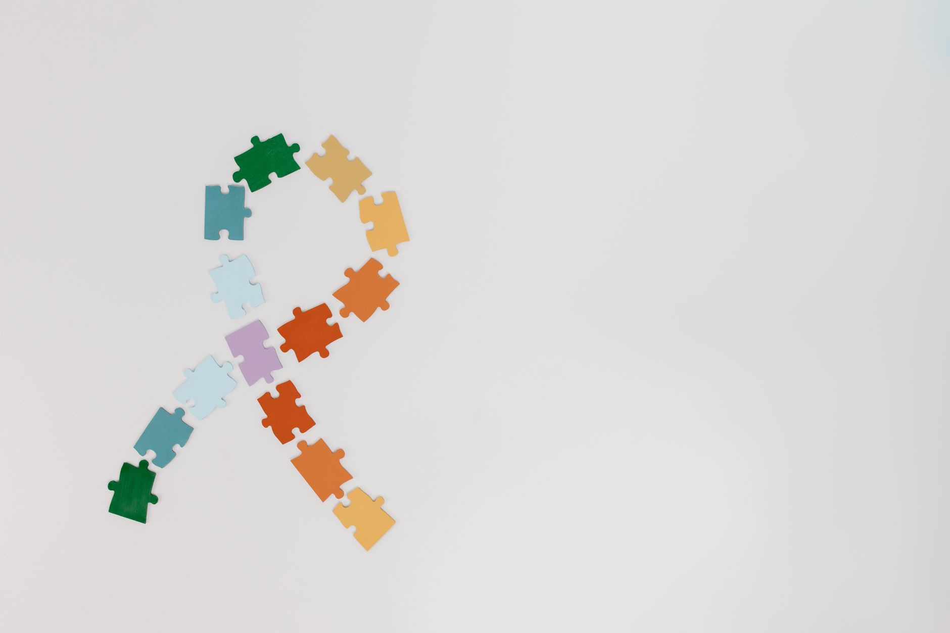
The mental health ribbon movement borrowed its format from the red AIDS awareness ribbon that became globally recognized in the early 1990s. From there, different advocacy groups started claiming colors for specific conditions, sometimes overlapping, sometimes clashing. It can look chaotic from the outside, but there’s more logic underneath than most people realize.
What Each Color Represents
Green is the anchor. The green ribbon was adopted as the global mental health symbol in 1994, the same year the World Federation for Mental Health formalized the awareness calendar we still follow today. Not all greens are equal here, which causes real confusion. Mental Health America uses lime green specifically because it signals freshness and energy rather than clinical calm, while other groups use a deeper emerald to suggest stability. If you’re designing campaign materials, it’s worth checking which shade your partner organization actually uses, because mixing them reads as careless to people inside the movement.
Yellow carries a different weight entirely. The Yellow Ribbon Program, founded in 1994 in Colorado after a teenager’s suicide, turned yellow into the primary color for suicide prevention. The original yellow ribbon referenced hope and return, not grief, which was a deliberate choice by the founders. Teal covers anxiety disorders and PTSD awareness, sitting between the calming associations of blue and the growth associations of green. Purple shows up in two places that overlap more than people expect: epilepsy awareness and domestic violence prevention, both of which have significant mental health dimensions.
The Psychology Behind the Choices
Green’s selection wasn’t arbitrary. Stephen Kaplan’s 1989 attention restoration theory, built on years of environmental psychology research, found that natural green environments consistently lowered mental fatigue and produced feelings of calm and cognitive recovery. That research was already circulating in clinical circles when mental health advocacy groups were formalizing their symbols. Green signals safety at a fairly deep level, probably because of its evolutionary connection to environments with water and food.
Yellow is psychologically complex. It’s the most visible color to the human eye under normal lighting, partly why it appears in warnings. But it also carries warmth and optimism in most Western color research, and the Yellow Ribbon founders leaned hard into that angle, using yellow to represent a door opening rather than a life ending. That framing was intentional and, from what I can tell, fairly sophisticated for a grassroots campaign started by grieving parents.
Teal works for anxiety awareness because it doesn’t carry the clinical coldness of pure blue. People associate straight blue with authority and structure, not always the right signal for conditions like generalized anxiety disorder or PTSD where the person already feels over-regulated. Purple, meanwhile, has a long history of signaling dignity without aggression, which suits both epilepsy and domestic violence contexts where stigma is a central barrier to getting help.
How to Use These Colors Correctly
World Mental Health Day falls on October 10 every year, and that’s when most campaigns hit peak visibility. The green ribbon is your safest universal choice around that date. But specificity matters: using teal when you’re talking about anxiety support, or yellow when you’re working in suicide prevention, signals to affected communities that you actually know the field.
A few practical things I’d flag. Don’t mix lime green and emerald green in the same design without knowing which your partner organization uses. Purple’s overlap between epilepsy and domestic violence isn’t an error (it reflects how often those issues intersect in real people’s lives), so don’t try to resolve it. And if you’re producing printed materials, test your greens against white and dark backgrounds, because lime green washes out badly in some print runs. That last one catches people off guard more than you’d think.
Mental health awareness colors work because they give people a quick, low-barrier way to signal solidarity. That only holds up if the colors are used consistently and with some understanding of what they actually represent. Using the right color in the right context is a small thing, but it tells someone struggling whether you did the reading or not.
FAQs
What color represents mental health awareness?
Green is the primary color for general mental health awareness, adopted globally in 1994. Check whether your organization uses lime green or emerald before printing anything.
What does a green ribbon mean in mental health?
A green ribbon signals support for mental health awareness broadly. It’s been the recognized global symbol since 1994, worn especially around World Mental Health Day on October 10.
What color is for anxiety awareness?
Teal is the recognized color for anxiety disorders and PTSD awareness. It blends the calming qualities of blue with the restorative associations of green.